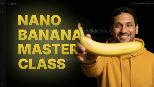
Master AI-Generated Logo Design using Nano Banana
Along with two other approaches, understand and use the 7-step prompt framework for generating great logos with Nano Banana. Master a lot of real-world prompting tactics along the way.

The logo acts as the face of your business.
So, it is important that we have a decent logo, if not a great logo, for our business.
But logo design is complicated because it is totally subjective.
If you love a logo for whatever reason, and if you present it to your friend or a peer, they might not like it at all.
Also, if you want a logo done, sometimes it is not easy to explain it to the designer.
So, you just end up sending reference images.
On top of that, working with good logo designers costs a significant amount of money.
They work hard to produce great, meaningful, and impactful logos so that people can remember your brand for years, if not decades to come.
But most of us can't afford them. We can't ask them to work for cheap either, because it is unfair to take advantage of their hard work.
So, I used to turn to Free Logo Design apps.
But as you may know, it is hard to find good logos there. They just throw templates at us.
They say they use AI, but I was never convinced because of the type of logos they throw at my face 🗡️
So, for my online endeavors, such as UsableWP, Minilessons, and many others, I designed logos myself.
I like them, but because I am not a good logo designer, I don't love my designs. They are far away from my original expectations.
But Nano Banana changed my situation completely with its creative abilities.
It generated some logo designs that I liked more than my average designs.
So, I can confidently say that it is generating above-average designs 📦
It even helped me edit those logos and transform them into my liking (up to a certain level).
Logos generated using Nano Banana
In this chapter, I share my exact process for generating good, if not great, logos with Nano Banana.
But before we get started...
Logo designers create more than just a graphic. They develop a visual representation of a brand's identity.
So, I would recommend using Nano Banana only:
1. To help us convey our vision to the logo designer
2. Or, to produce logo designs when we can't afford a professional logo designer but are still determined to design everything by ourselves.
However, Nano Banana only allows you to download your logo in PNG or JPG format.
You can ask it to prepare an SVG file, but be ready to expect crooked results.
So, you still need a designer to convert the PNG-based or JPG-based logo image into a usable design file in SVG format, to be able to use it across various channels, such as websites, business cards, ads, etc.
If you are a logo designer, please know that I respect your work, and you can use the following techniques to ideate fast and help clients.
I am going with a free version of Gemini
Logo creation with Nano Banana involves generating a ton of images.
So, you'll run into time limits:
When you hit the time limit, you can wait for a day and then resume your work.
Or you can just upgrade like I did.
I upgraded because I started creating images regularly.
Moving on...
The Logo Design Process
There are many approaches for generating good enough logos with Nano Banana.
- Provide the brand name and its purpose to an AI model and ask it to generate prompts that create logos for you (Easy)
- Get creative and write your detailed prompt that expresses your inner vision in words. (Hard but worth it)
- Use a reference image and ask AI to generate a logo similar to it (mostly illegal)
And the process changes from approach to approach.
So, let's look at them in a detailed way.
Approach 1: Asking AI to create logo generation prompts using the brand name and its purpose
This is the easiest approach because AI will do everything for you.
It involves four steps:
- Tell the AI about your brand - Give it the name and explain what your business does
- Ask for help - Request the AI to create five different logo generation prompts
- Finally, generate logos using each prompt one by one.
- Further refine the logo you like
Step 1 and Step 2: Provide the brand details and ask AI to generate prompts for creating logos
Open up Gemini and create a new chatbox:
Next, type in the following prompt:
The logo should look good at any display size. For example, it should look meaningful even when displayed at 16px as a favicon.
The prompts should begin with "Generate a logo"
In the above prompt, I provided the brand name and its purpose and asked AI to generate prompts for creating logos that look good across all sizes.
You might want to tweak it according to your design taste.
For example, I like minimal logos. You might not.
Anyway, I went ahead and submitted the prompt, and it came up with the following prompts:
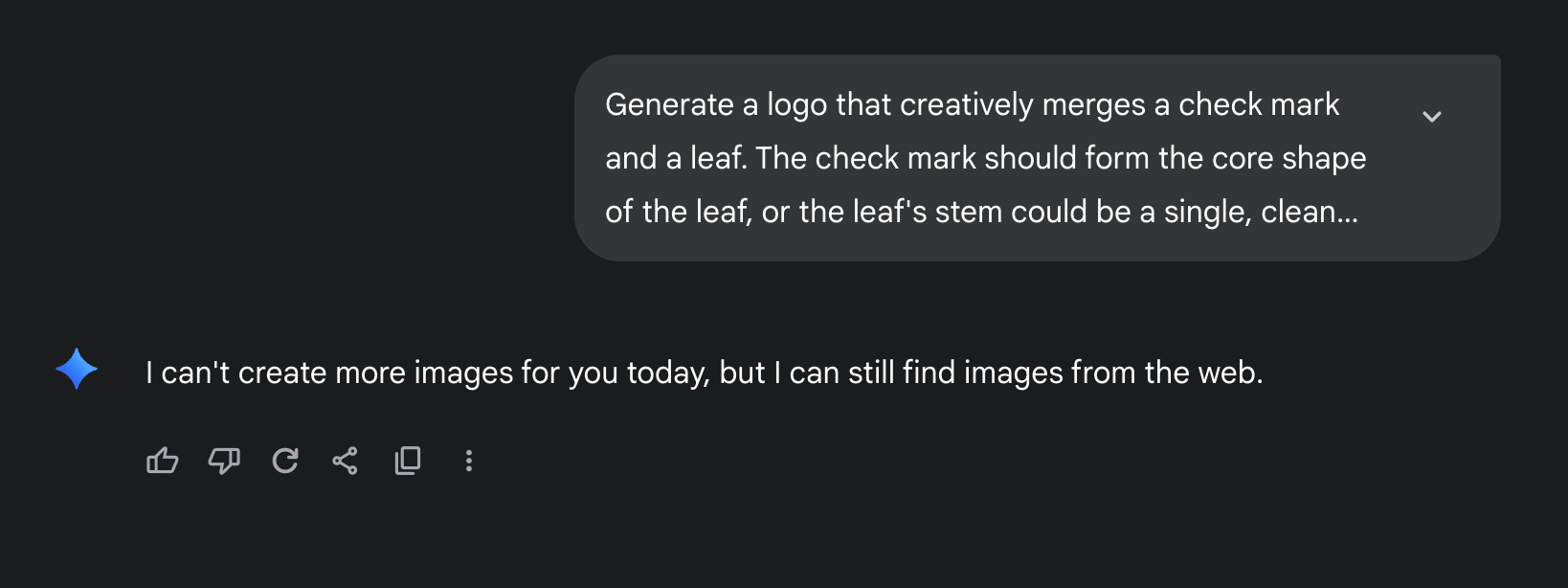
- Generate a logo that creatively merges a check mark and a leaf. The check mark should form the core shape of the leaf, or the leaf's stem could be a single, clean check. Use a bold, solid line style with a natural green color to ensure the icon remains clear and meaningful even when scaled down to a 16px favicon. The design should avoid any unnecessary details like veins or complex shading.
- Generate a logo featuring a stylized tree silhouette where one of the branches or the entire canopy is shaped like a check mark. The tree should be symmetrical and simple, using a two-color palette—one for the trunk and another for the canopy. The design must be a flat, vector illustration, ensuring it retains sharp edges and a consistent appearance at any size.
- Generate a logo that combines a water droplet with a check mark. The check mark should be subtly integrated into the droplet's form, perhaps as a negative space cut-out or as the reflection within the droplet itself. Use a calming blue for the water droplet and keep the overall shape smooth and clean, without any complex gradients or textures that would be lost at small sizes.
- Generate a logo with a globe icon that has a check mark wrapping around it like a protective orbit. The globe should be represented by a minimal circle with a few simple lines to suggest landmasses. The check mark should be a distinct, clean shape that visually encompasses the globe, symbolizing global environmental tracking. The color palette should be limited to green and a soft blue.
- Generate a logo that uses two interlocking shapes: a half-circle to represent the "eco" (like a sunrise or a sunset over the horizon) and a clean, sharp check mark that fits into it, symbolizing task completion. The design should be abstract and balanced, with the two shapes fitting together like puzzle pieces. Use a deep green and a warm yellow or blue to create visual interest while maintaining a minimalist and modern aesthetic.
Next, we should try out these prompts.
Step 3: Inside Gemini's chatbox, run the logo generation prompts one by one to create logos
Here are my results after executing the above prompts individually and repeatedly in no particular order:
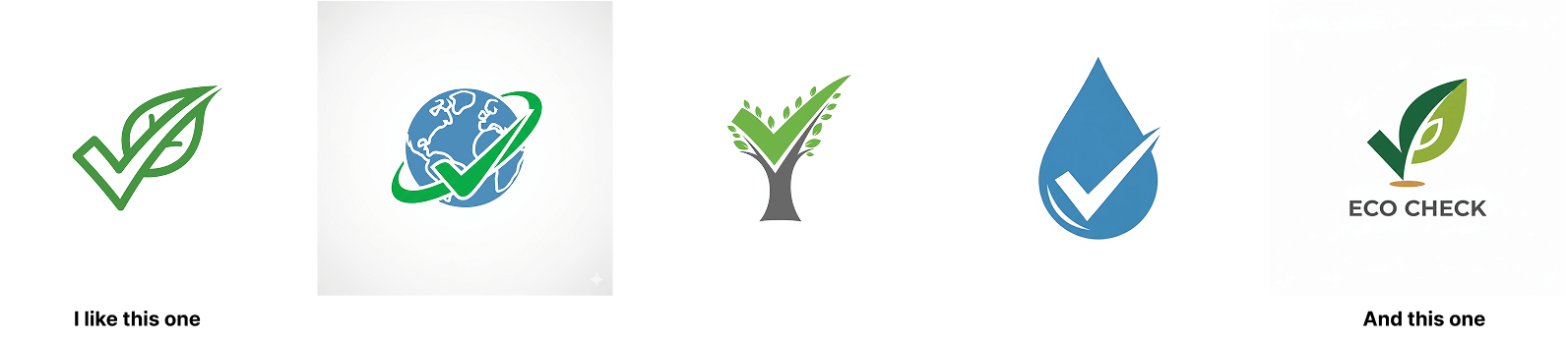
I liked the first one and kinda liked the last one.
I would repeat the process to generate five more logos, followed by five more.
It is a numbers game.
Every 10 logos you generate, you might only like one or two of them.
Ideally, you should generate at least 50 logos until you create the one that impresses you.
And once you find the right one, then tweak it with modification prompts to refine the logo until it becomes usable for your needs.
For example, I really liked this logo:
But it looks like it needs to be further refined to fit my needs.
For example, I want to add the brand name "EcoCheck" underneath the logo symbol.
So, I open up a new chat inside Gemini, upload the newly generated logo, and then say:
And here is the result:
Nice.
But notice that the gap between the icon and the brand name "EcoCheck" is quite big.
I want the gap to be 15px. Not more than that.
So, I said:
The result:
Nice.
Next, I want to align the symbol and the name horizontally and reduce the size of the symbol to see how it looks.
We need to perform several tweaks to achieve a specific look for the generated logo.
And you can perform these tweaks until Nano Banana stops listening to you or you get frustrated.

Hahaha, it stopped listening to me after my third request.
Hmm, it happens pretty often. I hope they fix it.
But anyway...
Rescue Tip: When Nano Banana Stops Listening
You can make it to listen to you by opening up a new chat and uploading the most recent refinement of the logo 🕶️
It works for me every time.
Anyway, next comes...
Approach 2: Get creative and write a detailed prompt that expresses your inner vision in words.
This approach is not impossible.
You should be patient and consider taking a good amount of time to craft the logo generation prompt.
I'll be honest with you.
Most people rush when making logos with AI.
They type a prompt like:
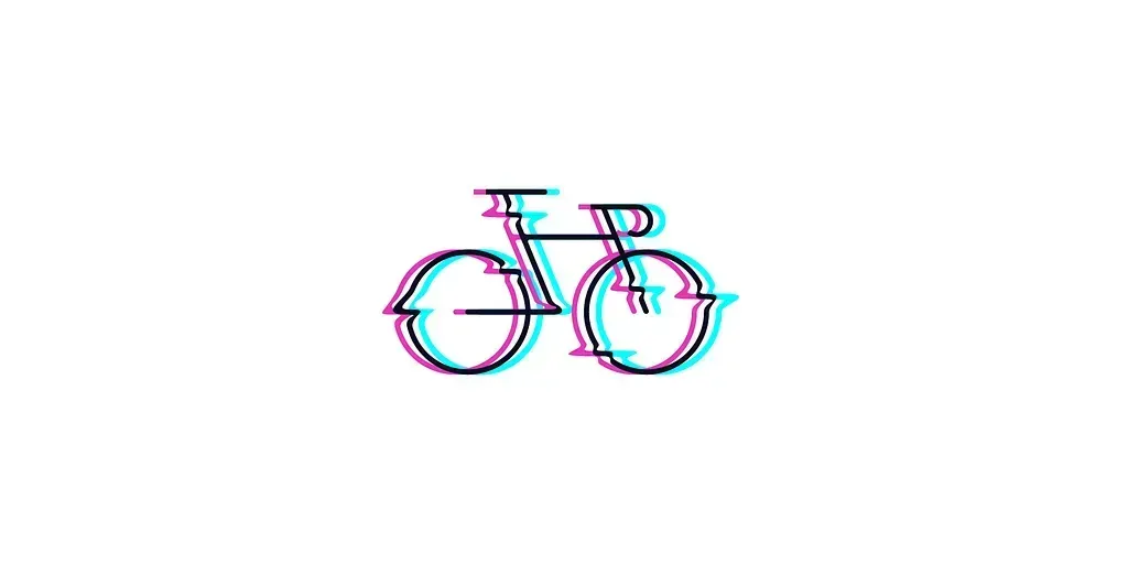
And they wonder why the results look weird like this:
- Where is the rear tire?
- And it is "VoltCycle", not "Volta Cycles".
But here's the thing: If you want a logo that actually represents your brand, you need to put in the work upfront.
And that work is writing a really good prompt.
Seriously. No kidding.
There is a good reason why most logo prompts fail
You type: "Create a tech company logo," and AI gives you: Something that could be for any tech company anywhere.
It's like walking into a restaurant and saying, "Give me food."
The waiter will look at you weirdly. You'll get food, but it might not be what you wanted.
You see the problem?
Your prompt is too vague, and because of that, the AI doesn't know:
- What your company actually does
- What feeling do you want people to have when they look at your logo
- What colors do you like
- How simple or complex you want it
I had the same problem. So, I ended up with...
The 7-Step Framework That Actually Works
After testing hundreds of logo prompts for multiple real-world businesses, I found a pattern.
Nano Banana generated likeable logos from prompts that cover these seven areas:
- Start with your brand's personality
- Describe your main element
- Pick your style direction
- Choose your colors smartly
- Add symbolic meaning
- Specify the technical stuff
- Set the layout
Haha! This looks complicated.
Don't worry :)
Please bear with me for the next five minutes. You might change your mind.
1. Start With Your Brand's Personality
Don't just say "modern logo."
Please don't do that.
Be specific about the feeling.
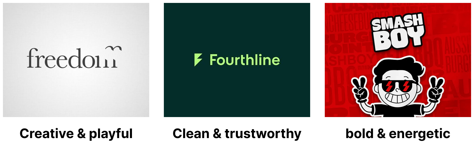
For example:
- Bold and energetic
- Clean and trustworthy
- Creative and playful
Simply put, instead of saying "Modern logo",
Try: "Clean and trustworthy logo that feels professional but approachable"
2. Describe Your Main Element
What should be the star of your logo?
Bicycle? Leaf? Thumprint? or a sheid?
Once you think through it, be super clear about it:
1) A bicycle (not just "transportation")

2) A coffee cup (not just "food service")

3) A house shape (not just "real estate")

3. Pick Your Style Direction
This is where you set the visual mood:
1) Minimalist line art
2) Bold geometric shapes
3) Hand-drawn illustration
Example: "Minimalist line art style using thick black lines"
4. Choose Your Colors Smartly
Don't say "colorful." Pick 2-3 specific colors and explain why.
1) Bright golden yellow icon with black background (for energy and clarity)
2) Light blue and white (for trust and reliability)
3) Bright green color with dark green background (for a natural and eco-friendly feeling)
5. Add Symbolic Meaning
I think this is what separates good logos from great ones. Connect your visual elements to your message:
Bad example: "Add a lightning bolt to the logo"
We didn't tell how to integrate the lighting bolt with the bicycle. So, it was added to the middle of the bicycle.
Because we were not explicit, the lightning bolt looks disconnected from the bike.
Good example: "Integrate a lightning bolt into the bicycle frame structure to show it's electric-powered".
See the difference?
6. Specify the Technical Stuff
These details make your logo actually usable:
1) "Consistent thick outlines throughout": If you don't say this, the logo might render with thin lines:
2) "Works well at small sizes": If you don't say this, the logo will have unnecessary details that make the logo look weird on small screens.
For example, notice the blue document symbol. It looks good when the logo is displayed at large sizes.
But here is how it looks when the logo is rendered at 50px on a website header:

As you can see, it makes the logo look weird. People looking at it can recognize the green leaf checkmark, but they will fail to understand the tiny blue detail.
Not a good sign for a brand logo that must be remembered for a long time to come, isn't it?
3) "Clean geometric shapes": If you don't say it, you might not get this geometric logo:
Instead, you might get this:
4) "High contrast for easy reading": If you don't say it, you might get a logo with a low-contrast design.
For example:
And finally...
7. Set the Layout
Tell the AI how to arrange everything:
- "Centered design"
- "Horizontal layout"
- "Icon above text"
- "Symbol integrated with company name"
That's all.
I understand this framework is a lot to process.
But let me make things easier for you...
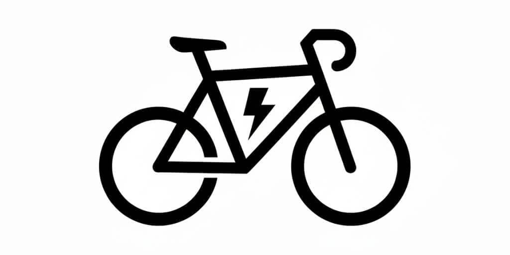
Real Example: Electric Bike Logo
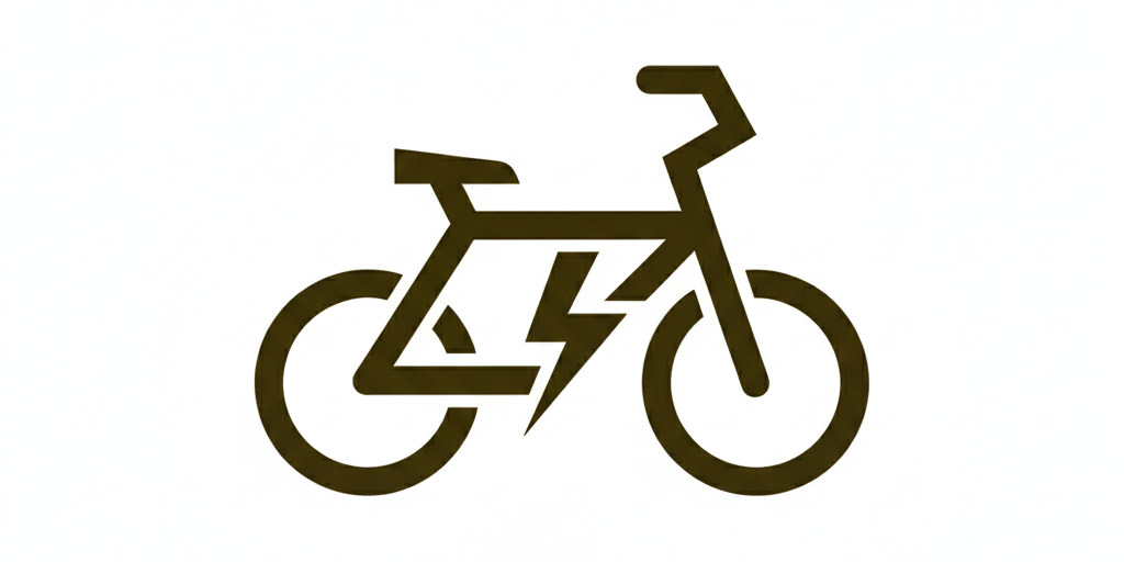
Bad prompt without our 7-step framework:
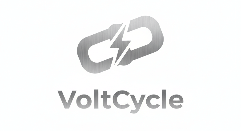
Because we left out a lot of details, AI took creativity into its own hands and generated this wild logo:
It looks good for an illustration, but bad for a logo because:
- It has multiple elements (plug & bolt) to convey that this logo belongs to an electric bicycle company.
- It has three colors, namely, light blue, light gradient grey, and dark grey.
- The lines are not thick enough for my needs
The logo disappointed my vision.
I wanted:
- Thick lines. Not thin lines.
- Yellow color for the bicycle. Not multiple colors.
- Black color for the background
- A clearly visible lightning bolt is integrated into the bicycle frame structure.
- Minimal logo with no gradients
So, instead of depending on creativity in the hands of AI, I took control of the process and wrote this prompt using our logo design framework:
The bicycle should be rendered in a clean line art style using thick black strokes, viewed from the side. The design should include two circular wheels, handlebars, and a seat.
Most importantly, integrate a lightning bolt symbol into the bicycle frame structure - the lightning bolt should form part of the frame geometry, creating a visual representation of an electric bike.
The entire icon should be drawn with consistent thick black outlines in a geometric, modern style.
The lightning bolt should be clearly visible as part of the bicycle's frame, emphasizing the electric/powered nature of the bike.
The logo should look good on all screen sizes. For example, the logo should look good at 32px with recognizable shapes.
And it resulted in this:
See the difference? The detailed prompt tells the AI exactly what to create.
Just to recap, here is...
One-Glance Prompt Skeleton for our 7-step framework
- Brand personality: clean/trustworthy | bold/energetic | playful/creative
- Main element: e.g., a minimal electric bicycle
- Style: minimalist line art | bold geometric | hand-drawn
- Colors: 2–3 max with hex codes + why
- Symbolic meaning: how the visual ties to the brand
- Technical: thick outlines, works at 16px, no gradients, high contrast
- Layout: centered | horizontal | icon above text | integrated
Also...
Use Negative Prompting whenever needed
When refining, add constraints to avoid common fails:
- No gradients. No 3D. No drop shadows.
- No small interior details that disappear under 24px.
- Avoid text rendering; symbol only.
Why This Takes Time (And Why It's Worth It)
Writing a good prompt might take you 30-60 minutes. That seems like a lot, right?
But think about it this way:
- A good prompt saves you hours of back-and-forth edits
- You get much better results on the first try
- You avoid the frustration of generating generic logos
- You actually get something that represents your brand and creative vision
Don't you think that this is worth the effort?
Quick template you can use
Here's a fill-in-the-blank template for our framework:
You can avoid rendering text on the logo by including "Render just logo symbol. No text."
There we go. I made things even easier for you 🤩
Here is an example for a family veterinary clinic:
And here is the result:
Looks close to what I wanted.
But as I said before, it could be just a starting point.
For example, I started with a prompt with a different color scheme and a heartbeat element, and ended up with a more earthly tones and a heart:
Next...
Approach 3: Using a reference image for requesting logo generation prompts
Steps:
- Go online and find a logo you like (make sure it's legal to use as inspiration)
- Upload the logo to an AI tool (Claude, ChatGPT, or Gemini)
- Ask: “Describe this logo in detail for use as a new prompt.”
- Use that description to generate a new logo
⚠️ But caution:
- Most reference logos are copyrighted. Copying them is not legal.
- Use this approach only with public-domain/CC0 or licensed material.
Anyway...
Common Mistakes to Avoid
Mistake 1: Being too generic. For example, "Modern logo" could mean anything.
Fix: "Clean, geometric logo with bold lines and minimal details"
Mistake 2: Forgetting about size. Your logo needs to work on business cards, browser tabs, AND billboards.
Fix: Add "recognizable at small sizes" and "works as a favicon" to your prompt.
Mistake 3: Too many colors. More colors = harder to reproduce and use.
Fix: Stick to 2-3 colors maximum.
Mistake 4: No connection to your business. A random symbol doesn't help people remember what your brand is.
Fix: Make sure your visual element aligns with your actual business.
The bottom line
Most people want quick results when creating a logo.
But if you’re designing a logo for your business, you owe it to yourself to slow down and do it right.
A strong logo is often the first impression people have of your brand.
It appears everywhere—your website, business cards, social media, ads, and more.
That’s why it’s worth investing time upfront to craft a thoughtful, detailed prompt.
A good prompt saves you endless frustration, reduces back-and-forth edits, and gives you a logo that actually represents your vision.
Yes, it requires patience.
But remember: a logo isn’t just decoration.
It’s your brand’s identity made visible.
Even if you don’t have design skills, Nano Banana gives you the tools to create something memorable, professional, and truly yours.
If you can afford a professional logo designer, that will always be the best option.
But if not, with this framework and some persistence, you can still achieve a logo you’ll be proud of.
Testing Your Results
Generating a good logo is just a starting point.
Once you get a logo you like:
- Size test: Shrink it to 32px. Can you still tell what it is? Does it have any weird-looking details?
- Color test: Does it work in black and white?
- Memory test: Show it to someone for 5 seconds. Can they describe it back to you?
- Context test: Put it on a business card, website header, and social media. Does it work everywhere?
How do I perform the context test?
That's exactly what we will talk about next.
Generating mockups using Nano Banana for context testing
Nano Banana is great at generating mockups for any purpose.
It also makes it really easy.
Come on. Let's see how.
First, ask your AI your favourite model to generate prompts for creating realistic mockups for context testing.
For example:
The prompts must be highly detailed.
In my case, I put the above prompt into Claude, and it came up with many prompts.
I chose and refined some prompts to tailor them to the business owner's requirements.
If a vital mockup prompt was missed, we should specifically request that prompt.
Here are some prompts for creating contextual mockups and their results:
First, I wanted to test the logo at the storefront of the business owner, and here is a highly detailed prompt that Claude generated for the same purpose:
Storefront Details:
1. Modern glass storefront with large windows showcasing electric bikes inside
2. Clean, contemporary architectural style with metal and glass elements
3. Well-lit interior visible through windows with premium e-bikes on display
4. Professional storefront signage area where the logo is mounted
Logo Placement:
1. Logo displayed prominently above the entrance or on a sleek wall-mounted sign
2. Proper lighting highlighting the logo (consider backlit or spot-lit options)
3. Logo should appear crisp, professionally installed, and weatherproof 4. Size should be proportional and easily readable from street level
Busy Street Environment:
1. Urban setting with moderate foot traffic and cyclists passing by
2. Parked cars and bicycles along the street
3. Other retail shops visible in the background
4. Natural daytime lighting with some shadows for depth
5. People walking by, some stopping to look at the bikes in the window
Atmosphere:
1. Clean, environmentally-conscious vibe
2. Professional and inviting storefront presentation
3. Modern urban setting that appeals to eco-friendly transportation enthusiasts
4. High-quality, realistic rendering with attention to materials, reflections, and lighting
Render in high resolution suitable for presentation purposes.
Inside Gemini, I added the prompt and uploaded the logo I want to perform contexting testing for:
The result:
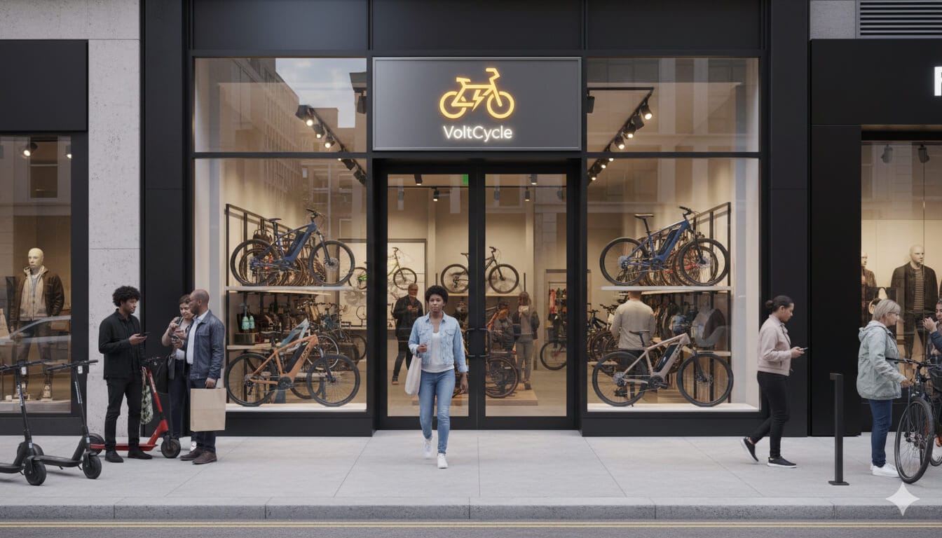
The logo looks pretty cool and functional at the storefront.
Anyway, next, I want to test the logo in a random, busy setting.
And here is the result:
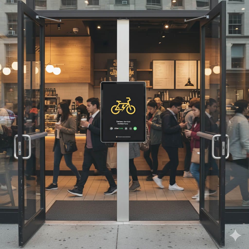
The logo looks pretty functional in a busy setting, too.
Another test passed.
But how does the logo look from a distance, though?
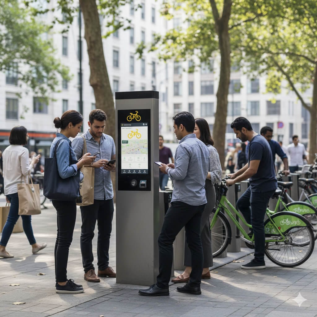
Not bad at all.
The logo looks really functional from a distance, too.
But so far, we have been testing the logo in a day-light setting.
How does it look in a night setting?
So, let's test it in a night setting and on a large digital advertisement screen at a bus stop:
Add "VoltCycle" brand name underneath the cycle, and both cycle and brand name should look vertically centered.
The result:
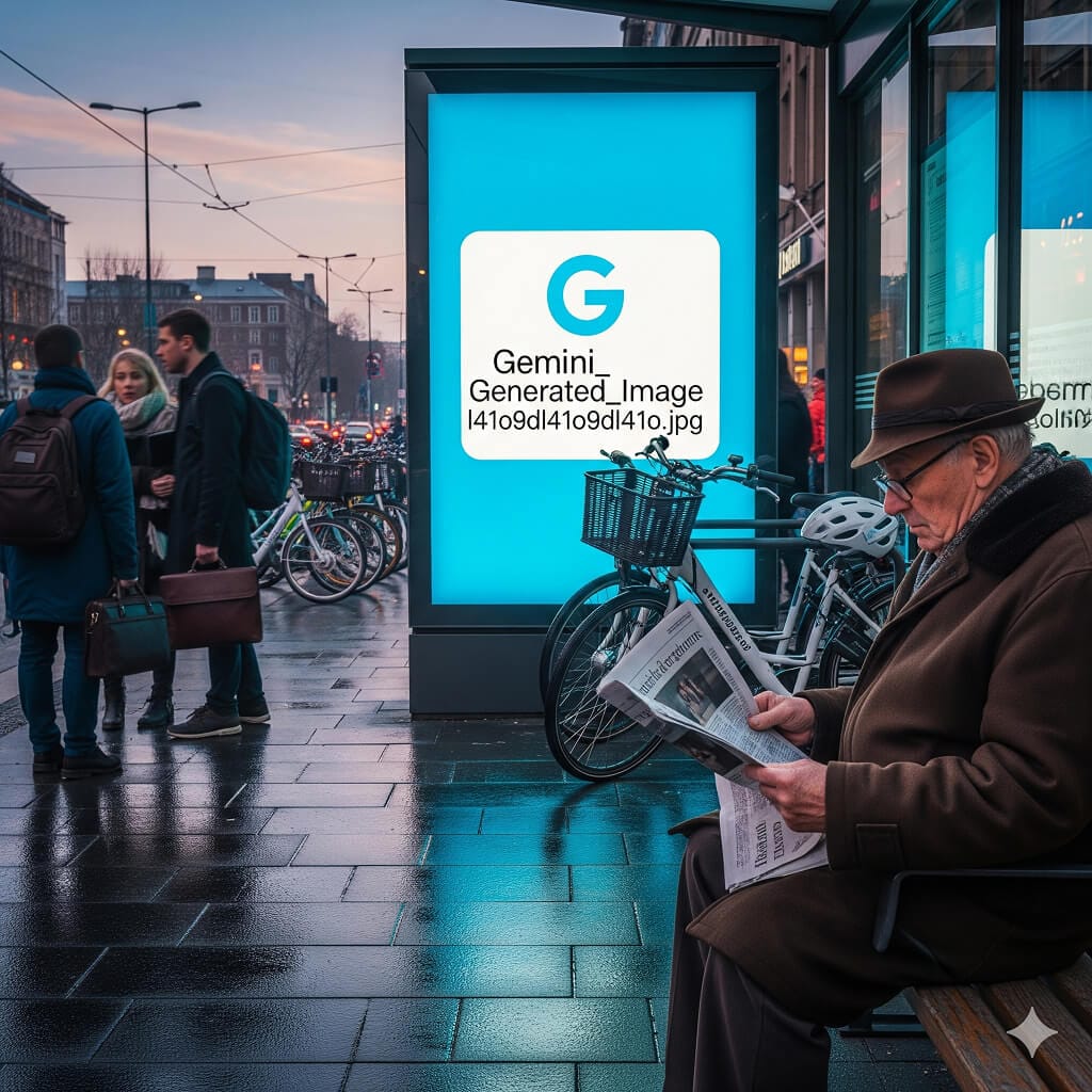
And bang!
A placeholder for a placeholder? 😁
Nano Banana couldn't use the logo uploaded for some reason.
If this happens to you, explicitly instruct Gemini to use the logo uploaded:
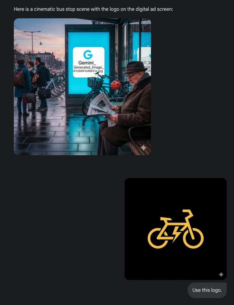
And here is the actual result:
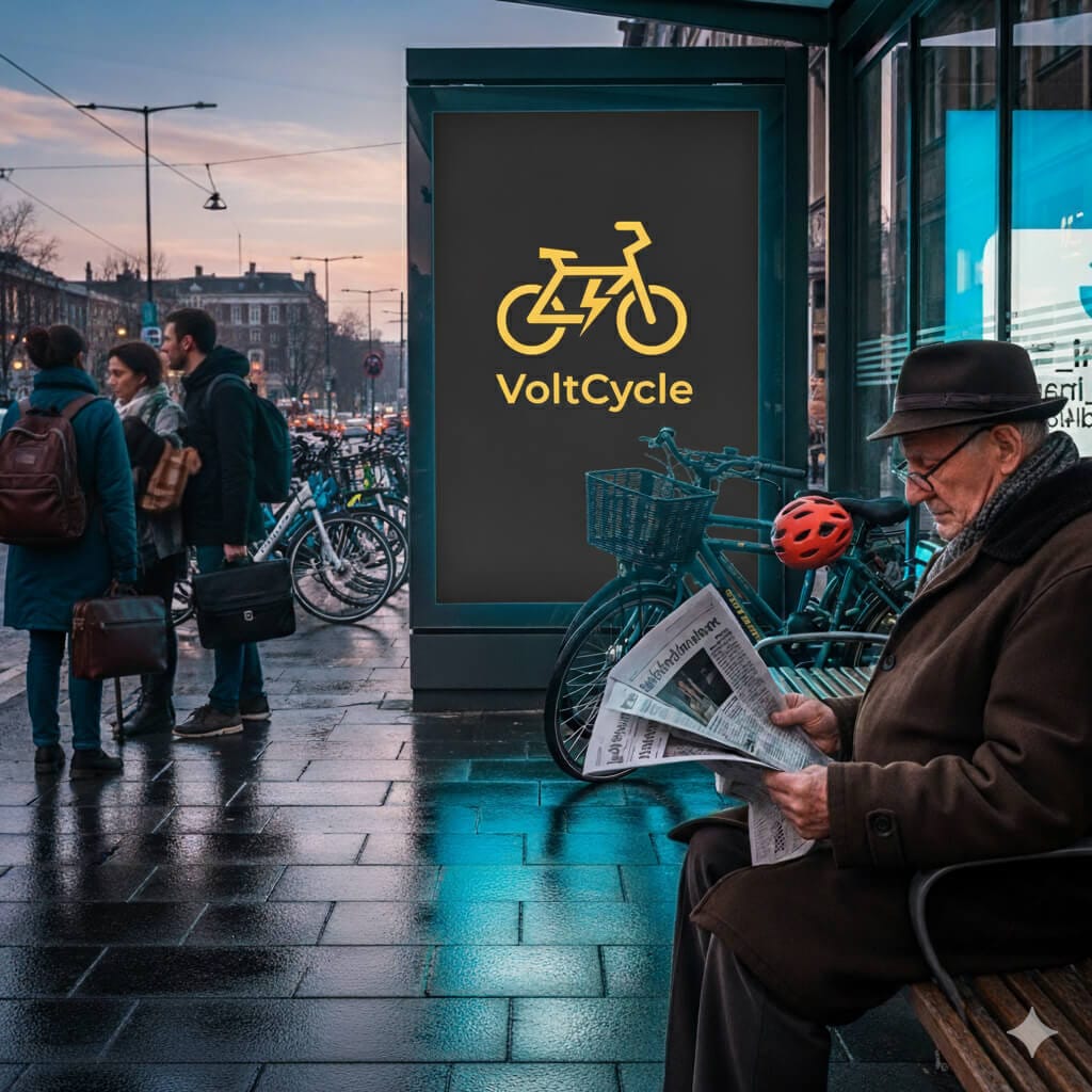
The logo is functional in a big size and under the lights, too.
Another test passed.
Finally, I want to test the logo by putting it inside a mobile app.
The result:
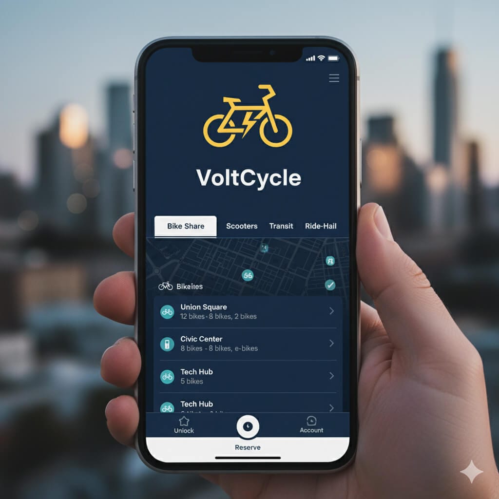
The logo looks functional on a mobile app, too.
Now, ideally, you need to keep performing these mockup tests in a variety of different conditions, papers, and screens.
So, continue to generate these mockups until you're satisfied.
That's all for this lesson.